Introduction
TASK dashboards is a feature to get a comprehensive understanding of the usage of TASK.
It allows administrators and moderators to have a view of the data generated by their organization and allow them to make informed decisions on how to improve.
Overview
The overview is the base page where the administrators will land when clicking on the Dashboard menu option
It shows the basic information regarding the all time data of the organization.
How to understand this view?
This view can be used to see quickly how do the organization compares to other similar organizations and the rest of the world.
It gives precious information on what are the strengths and weaknesses of the current state.
In this case, because the score in levers of opportunity is quite low, yet still higher than other universities, it may be interesting to design specific classes for that subject, because it is likely not taught anywhere.
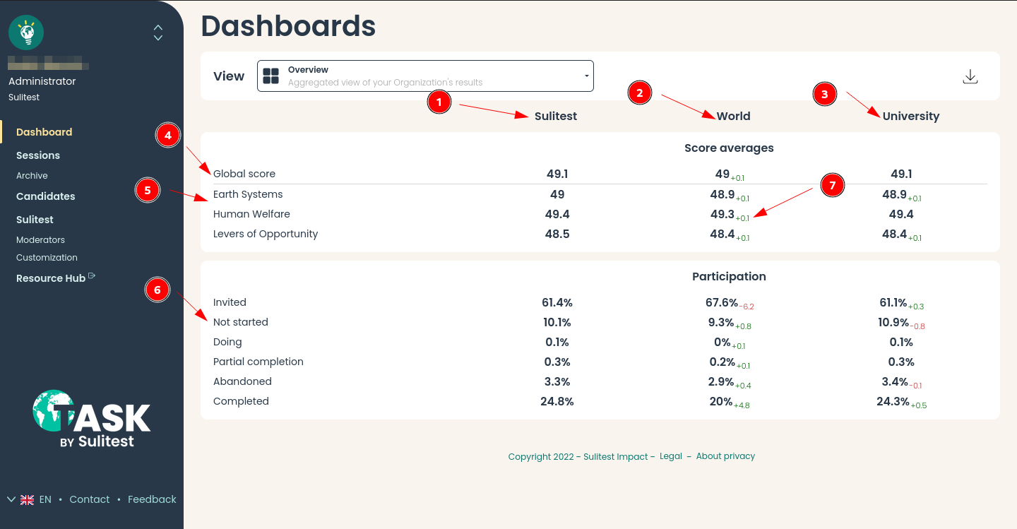
- Organization data
- Aggregation of world data
- Aggregation of data of organization of the same type
- Average global score
- Average score per framework
- Participation rate per status cf Understand candidate session status
- Differential of the organization score and the current column score
Timeline
The timeline view allows users to view the evolution of scores with time.
There are 2 detailed views:
CombinedShows all data aggregated
Entry / ExitShows data split by whether the session was done before courses or after
How to understand this view?
In the chart below, there is:
- In abscissa: dates
- In ordinate: the average score
This view allows to visualize the impact on changes made and evolution of candidates across a wide timeframe.
It is possible to leverage filters to have a more precise understanding of the evolution across certain topics / population
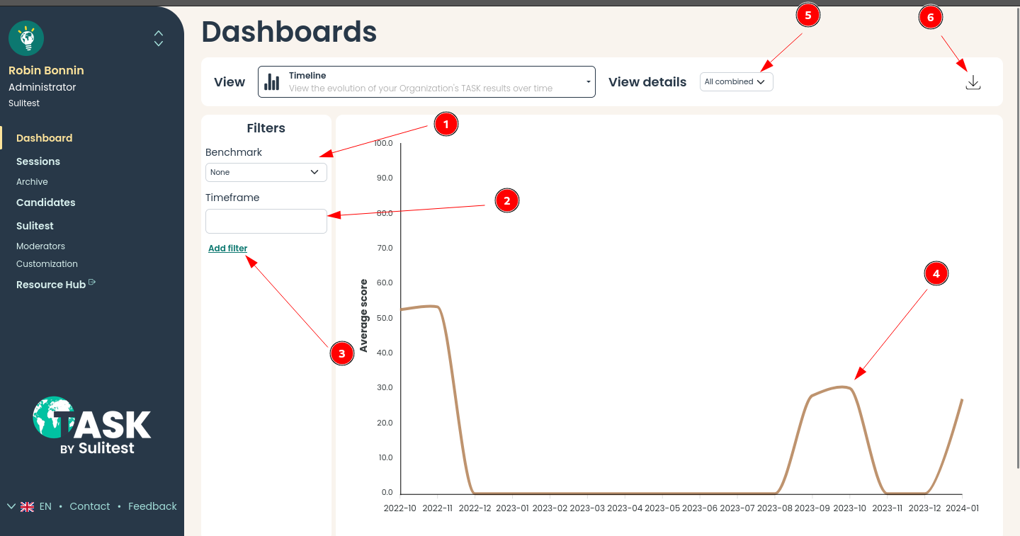
- Compare the evolution of score to other organization types
- Select a specific timeframe for the sessions
- Filter by any metadata
- Line graph the the average score
- Detail the view by splitting average score by:
- Entry / Exit
- Download the source data as CSV to deep dive the analysis
Matrix
This views shows the detailed scores per matrix item. (Matrix)
This allows the users to view on which subjects to focus the training of the candidates.
There are 3 detailed views:
FrameworkShows all data aggregated per framework
DomainShows all data aggregated per domain
SubjectShows all data aggregated per framework
How to understand this view?
In the chart below, there is:
- In abscissa: the frameworks, domains or subjects studied
- In ordinate: the average score
This view helps understanding which topics focused needs to be put on to have candidates progress
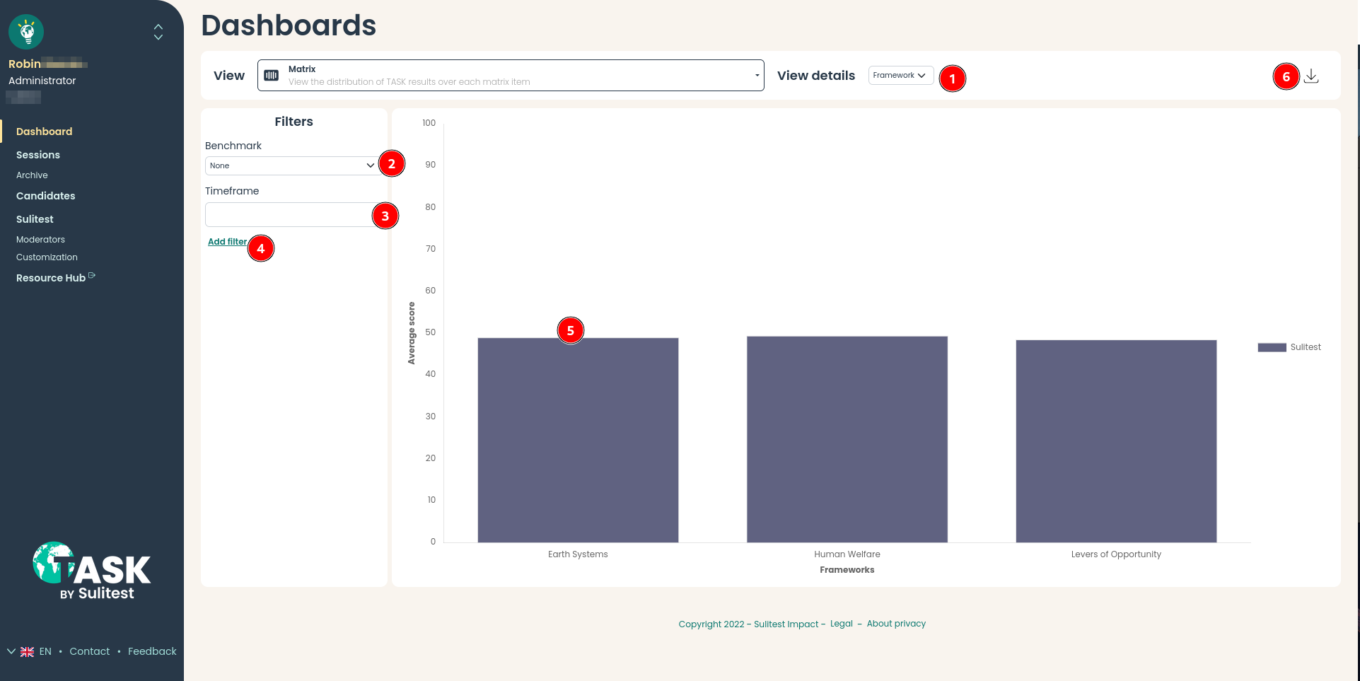
- Detail the view by splitting average score by:
- Framework
- Domain
- Subject
- Compare the evolution of score to other organization types
- Select the timeframe on which sessions should be selected
- Add filter by any metadata available
- Average score per data selected
- Download the source data as CSV to deep dive the analysis
Other views
Other views gathers data visualization graphs which do not fit in other views
We have today:
- Session comparison
- Score distribution
Session comparison
Select 2 sessions and compare them in details against each other
How to understand this view?
In the comparison below, we are looking at the detailed statistics of 2 sessions.
We have:
- 3 columns: session 1 data, session 2 data, comparison (session 2 - session 1)
- One section for score details
- One section for participation
This comparison gives the ability to make information decisions on what changes to make to improve either session deployment, candidate training
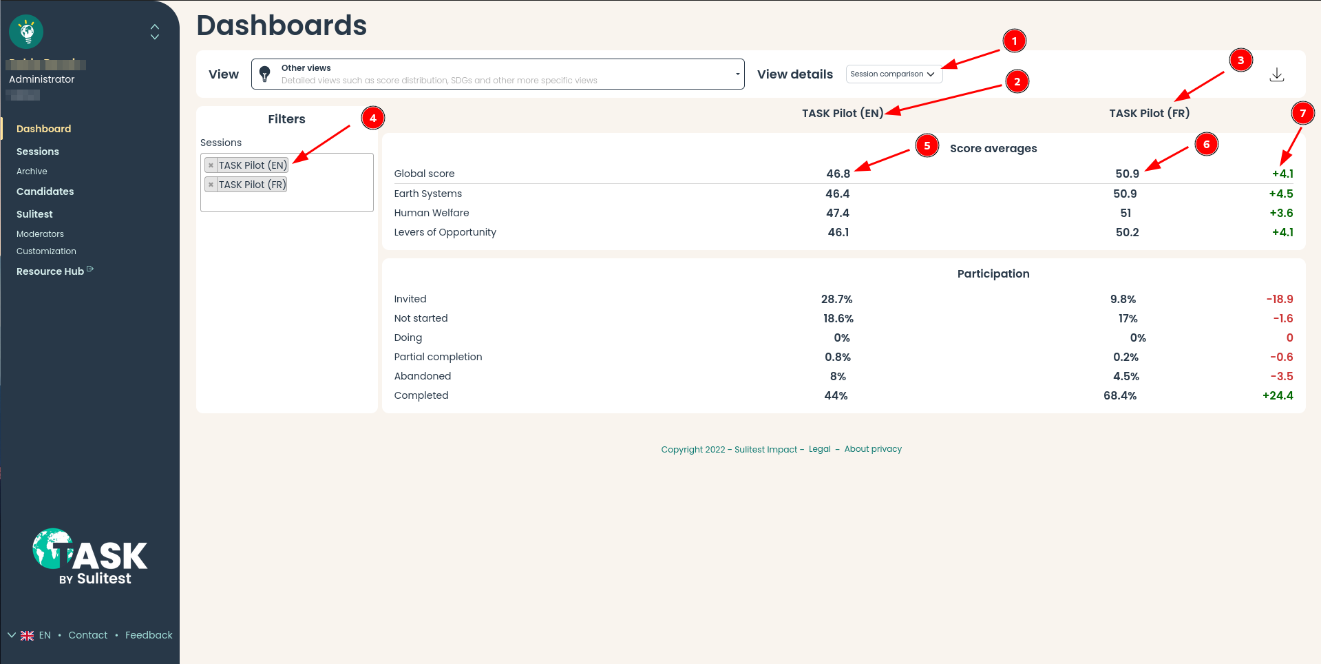
- Change the view details to
Session comparisonScore distribution
- Data column of the first selected session
- Data column of the second selected session
- Session selection area
- Average scores and participation for the first selected session
- Average scores and participation for the second selected session
- Differential between session 1 and session 2 data
Score distribution
The score distribution detailed view shows the distribution of score by splits of 10.
Giving a better understanding of score balance in the population will help drive changes in the teaching done.\
How to understand this view?
In the chart below, there is:
- In abscissa: the score grouped by a range of 10
- In ordinate: the percentile of number of candidates inside that range
What we see in the graph below is that almost 70% of our candidates have between 60-70, 10% between 60-70
and 0-10 and 20% have between 40-50.
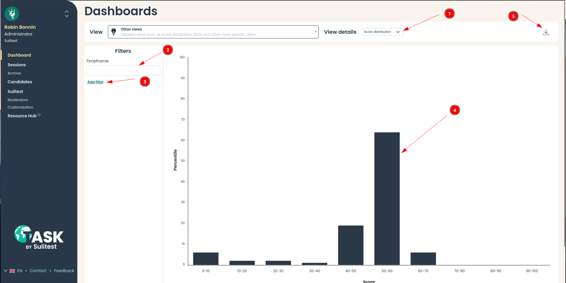
- Change the view details to
Session comparisonScore distribution
- Select the timeframe on which sessions should be selected
- Add filter by any metadata available
- Percentile of candidates falling into that score range
- Download the source data as CSV to deep dive the analysis
